
CREATIVE MARKET
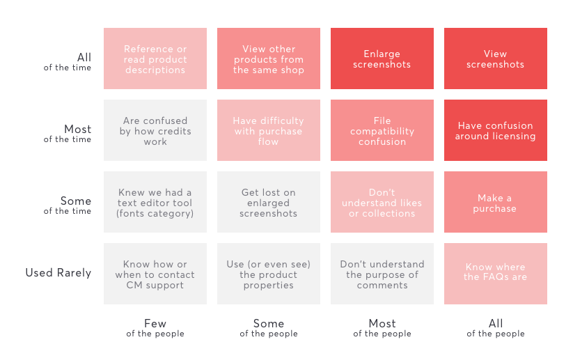
As the lead product designer at Creative Market, I was tasked to redesign their Product Page. The product page was the most frequently trafficked, conversion-based page on the site. After gathering past research summaries, I put together a red route analysis to help the team visualize what the most important aspects of the page.
SKETCHING THINGS OUT
Before jumping on the computer and getting into the more refined pixels, I like to get all my thoughts on paper and plot out a visual idea of what the final page would look like. I find this step to be a lot faster and easier to get all the elements out and move them for a better understanding of the flow and how the content will be organized.
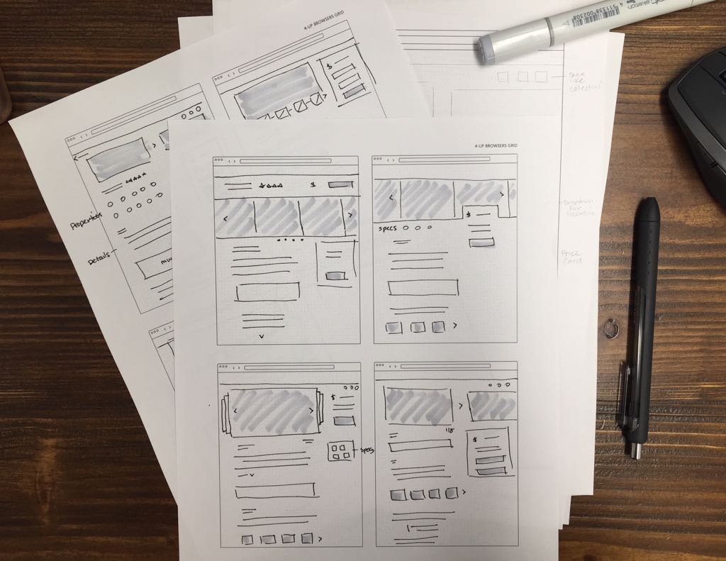
Creating these low-fidelity sketches also make it easier to sketch out and toss those that just don’t work without getting too attached too early explorations.
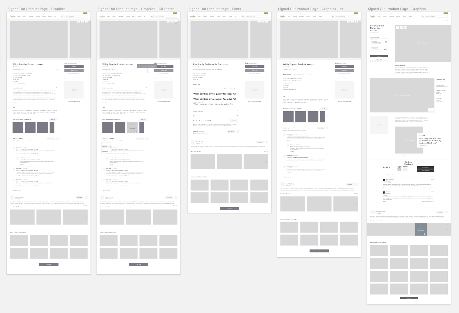
WIREFRAMES
Since the timeline was pretty short and we wanted to make sure we got all the information in the right order, the wireframes I created were a higher fidelity so they would be a closer representation of how we wanted the final designs laid out. These wireframes were created to give the team an idea of our content hierarchy, establish an overall approach, and also help to capture the various features and functionality that would be highlighted in the new page design.
EARLY EXPLORATIONS
Once we finalized the wires based on our internal feedback, it was time to get into the designs. Beyond the aesthetics of modernizing the current page, the new design included educational elements in the form of visual queues to help address some of the major pain points we identified in user research, allowing users to easily digest the information without feeling overwhelmed.
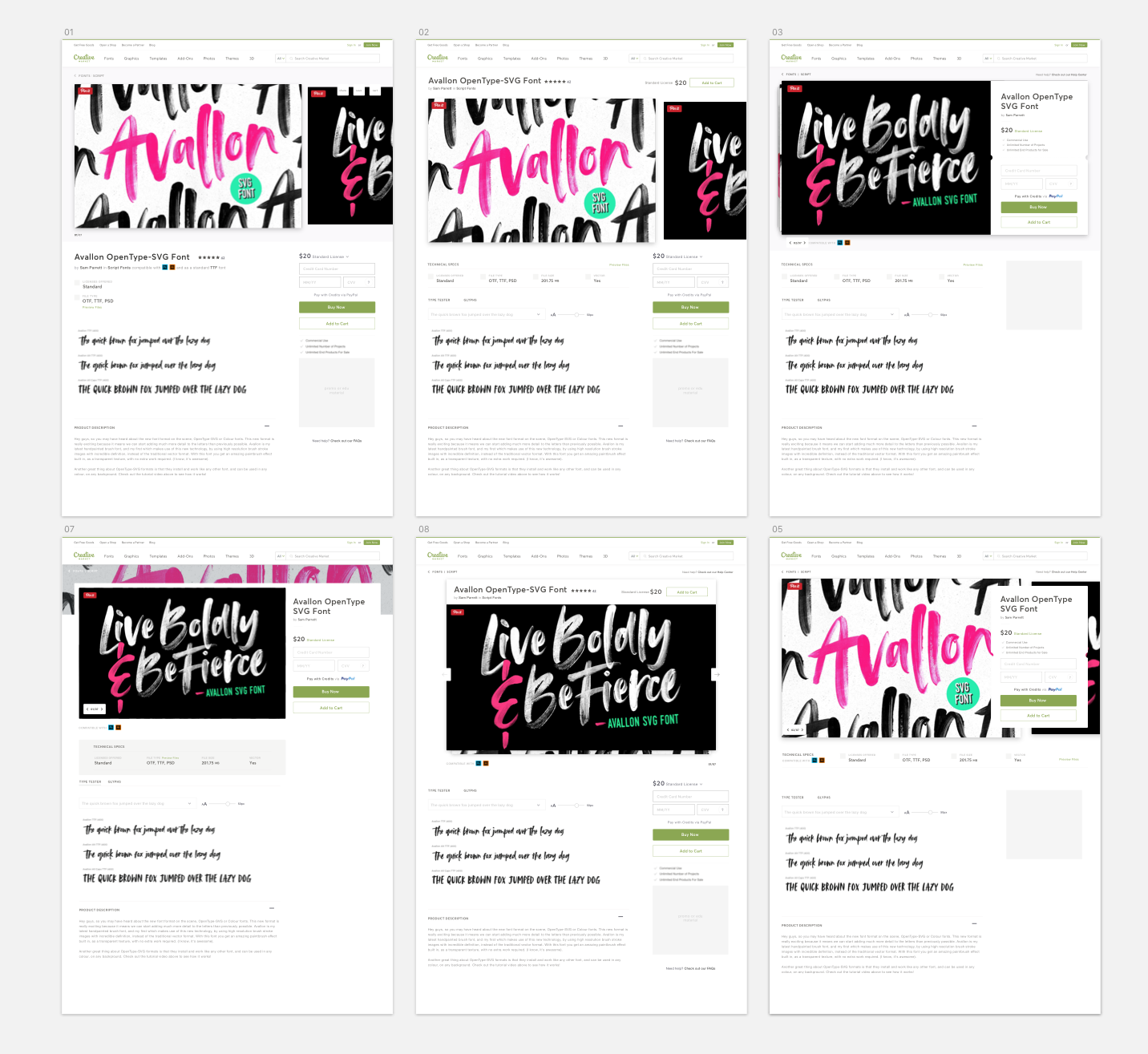
Another challenge was how to keep the tangible look and feel that has personified Creative Market. With the new minimalistic nav, we wanted to make sure there were still some more tactile details within the page, thereby honoring CM’s history and personality without competing with the shop’s actual product.
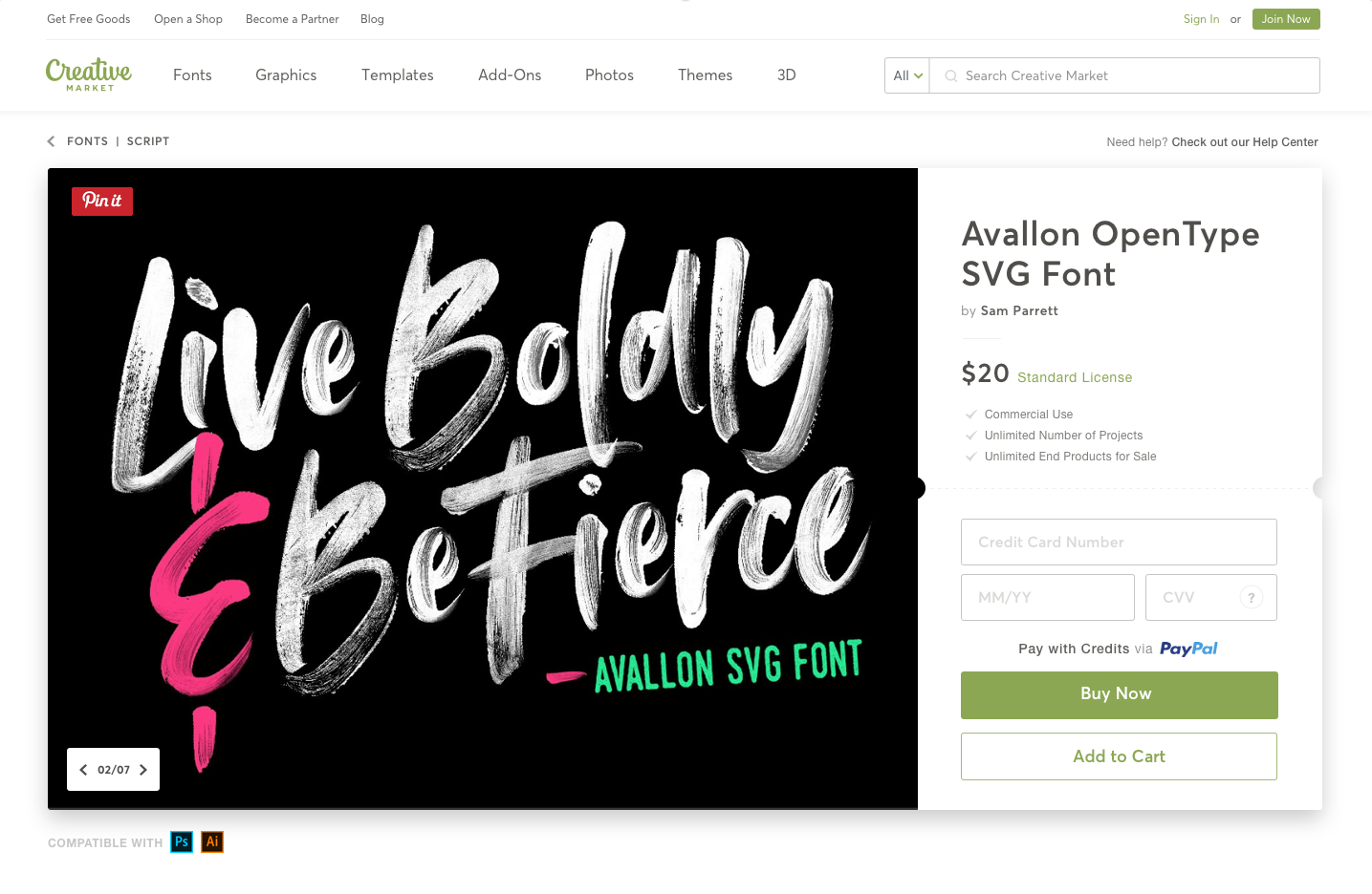
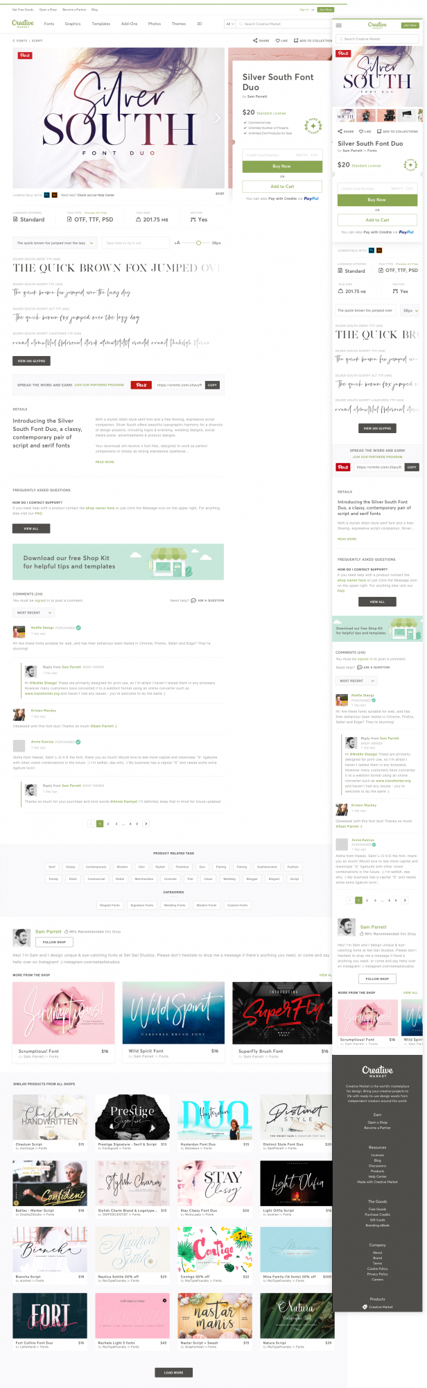
FINAL DESIGNS
After some prototyping and further user testing, I made some modifications to the design and we were ready to share this new page with our users.
The page underwent a month of a/b tests that was closely monitored by the team to see where we might refine some areas of the page based initial data. After that initial launch, we saw 14% increase of revenue and overall purchasing on the site had gone up.
If you've made it to the end, kudos and thanks for visiting!


