AZAMARA

DISCOVERY
Our initial discovery process informed the design of the experience and influenced the initial roadmap and digital strategy. I completed an analysis of the top competitors in the cruising and travel industries, as well as conducted stakeholder interviews to gather feedback on the existing experience, learn about our existing users, and uncover areas for improvement.

GATHERING REQUIREMENTS
We brainstormed features for the system that helped to achieve our goals, and rated them based on their business value, design effort, and technical complexity. This exercise allowed us to have a holistic view of all the included features and inform the ideal guest journey.
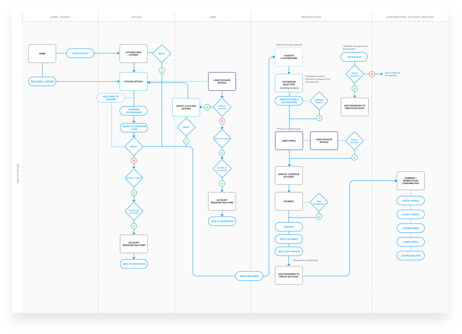
DEFINING THE UI
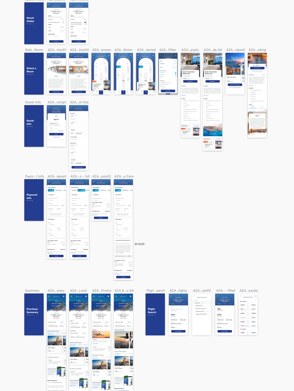
From there I began to define the UI framework and created wireframes for the rest of the experience. This process included many whiteboarding sessions with our product counterparts to try and get real-time feedback and nail some of the essential features and functionality. Below is a sample of wireframes I created for a portion of the booking flow.

MOBILE BOOKING FLOW
The first user testing session were met with great results. The completion rate, typically in single digits for guests, was just over 27%. Engagement with the booking flow was extremely high - all of the guests who completed the experience agreed it was clear and easy to understand and they would feel confident completing a purchase online.
DESKTOP & BEYOND
The next phase was to scale up from our mobile experience to desktop. The desktop explorations were extensive: from the full search experience, voyage and land details pages, stateroom details and of course, the booking flow - all were met with positive results and will continue to be designed as the program scales.


